Wedding Album Layout Ideas
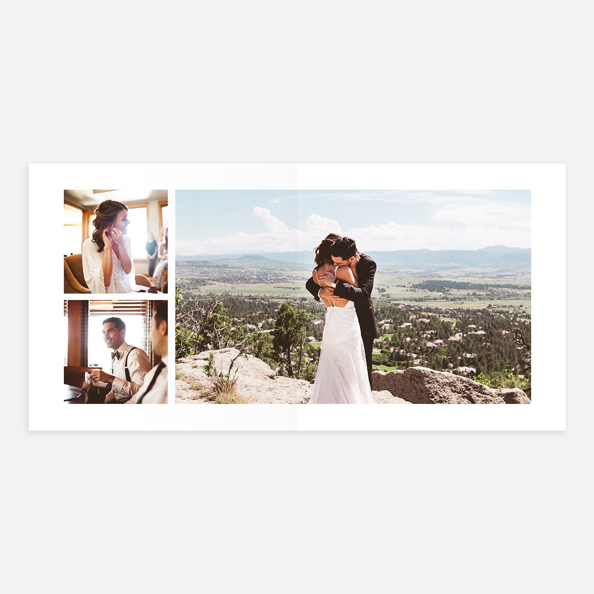
Often photographed in a succession of moments leading up to the big reveal, include two frames from the build-up and highlight the best reaction photo (bring on the tears) as your main image.
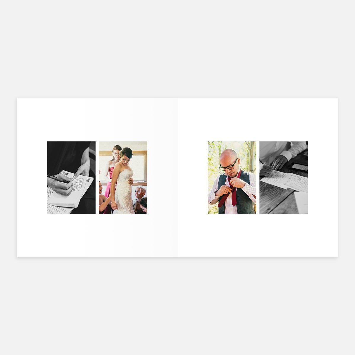
Show a photo or screenshot of each spouse's vows next to a "getting ready" photo of that person, connecting whose words they are with the anticipation they felt in preparing them.
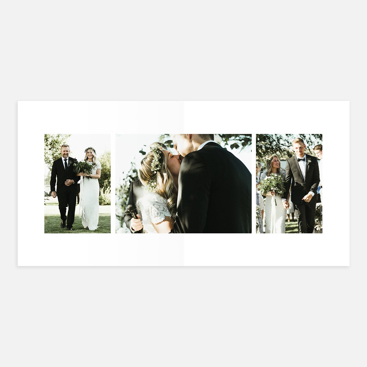
From the procession to the kiss and the final cheerful walk down the aisle, the ceremony has at least three photogenic key landmarks that could serve to sum up this meaningful part of the day in a full-spread series.
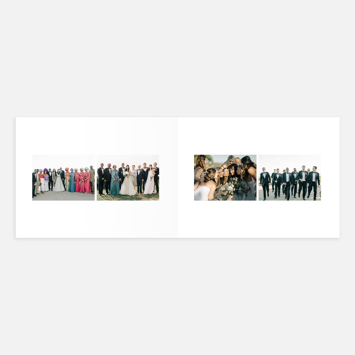
Big groups of people, whether it's the bridal party or extended family, call for wide-angle shots. Make sure everyone is in the frame using any of the landscape layout options. As an upside to creating a Layflat Album, you won't have to worry about someone's face disappearing into the middle binding crease of the pages with its continuous, full spread.
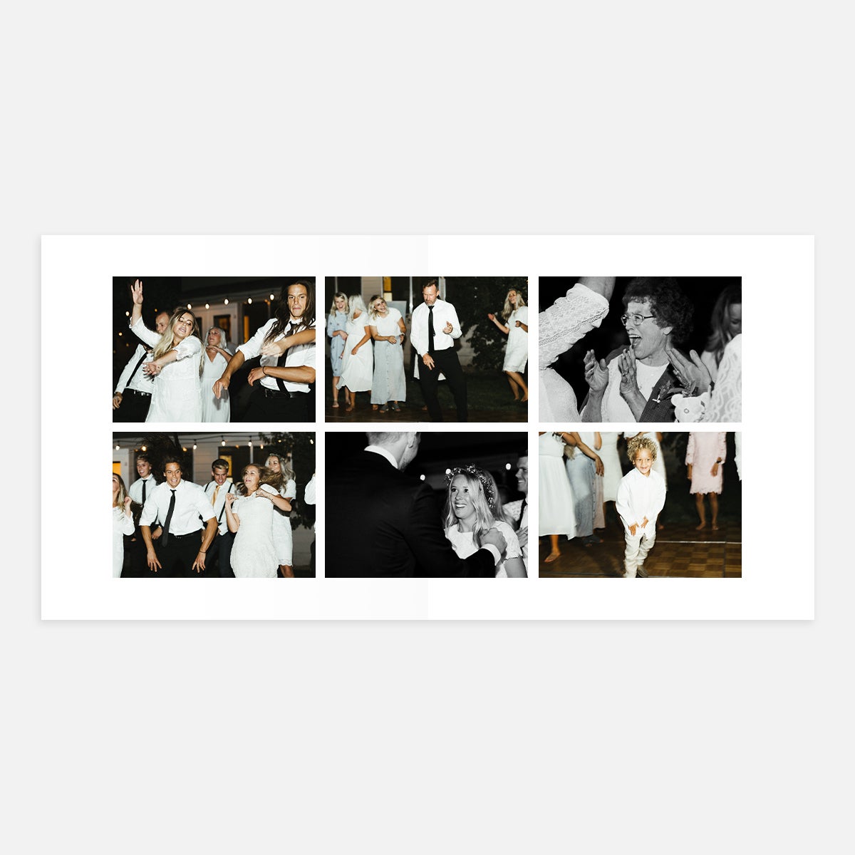
With so much action happening at any given moment, the dance floor produces some priceless shots. We're fans of recreating that commotion with a full spread — the blurry bodies, laughter, and all.
Bring Them to Life In
The Wedding Layflat Photo Album
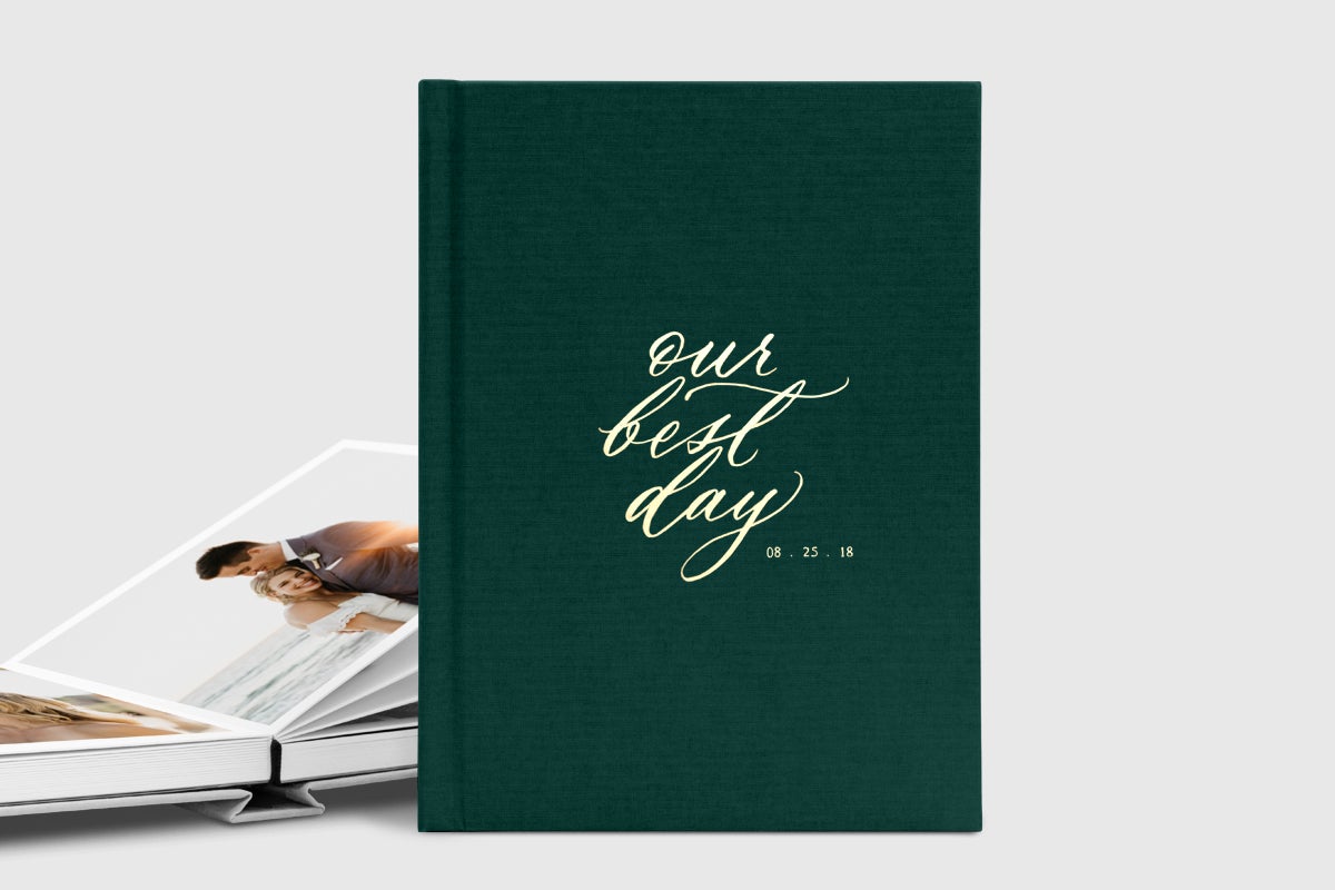
The perfect home for your wedding photos, the heirloom-quality Wedding Layflat Album is designed specifically for this life event and made to last. Its ultra-thick, panoramic pages and foil-stamped linen binding live up to the beauty of your big day, itself. These wedding album layout ideas can be brought to life through other Layflat products or a Hardcover Photo Book, as well!
Travel Photo Book Layout Ideas
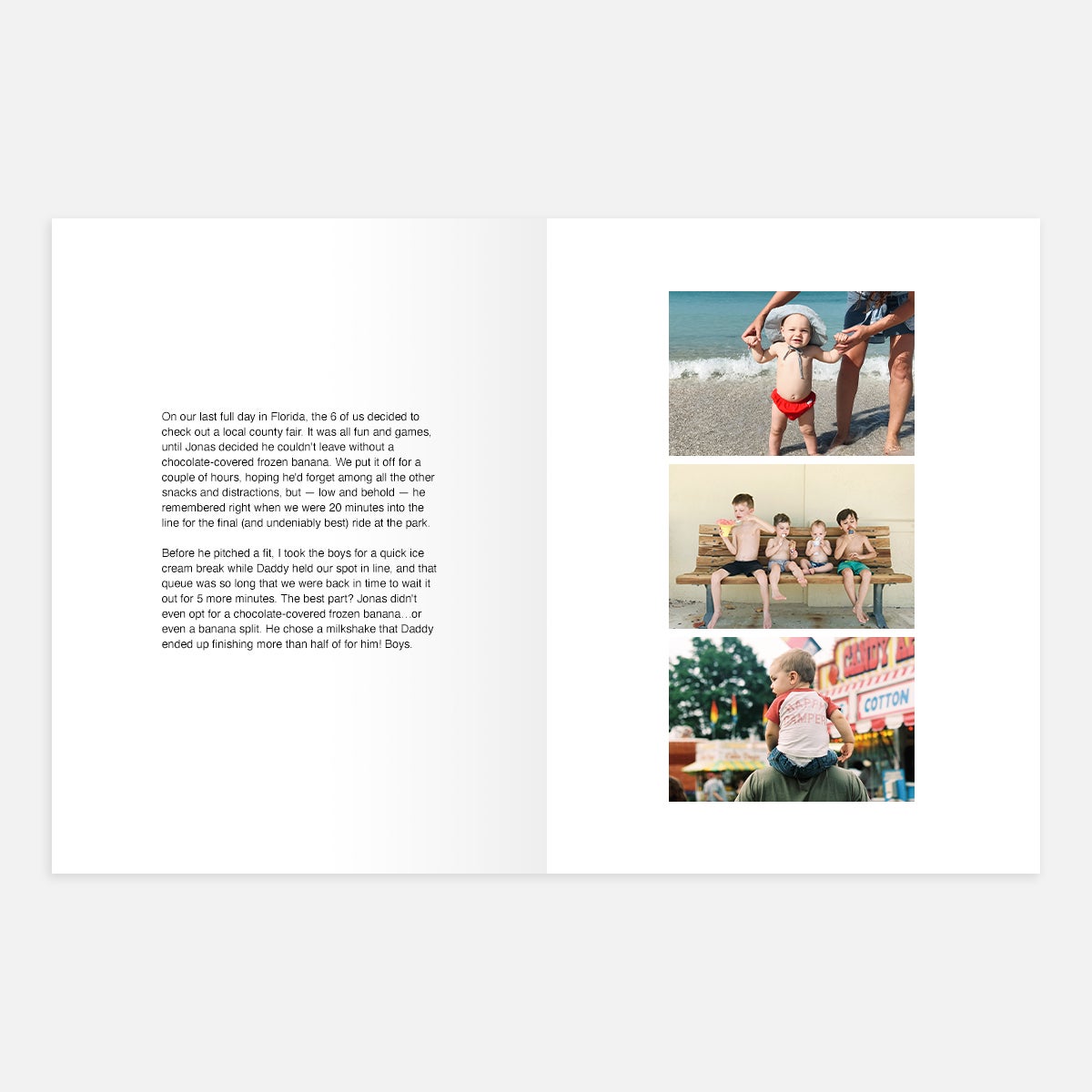
Travel always lends itself to stories worth retelling. From transportation hiccups to unexpected encounters, its these narratives that paint a complete picture of your trip. Use a full-page text layout to add context and color to your vacation album.
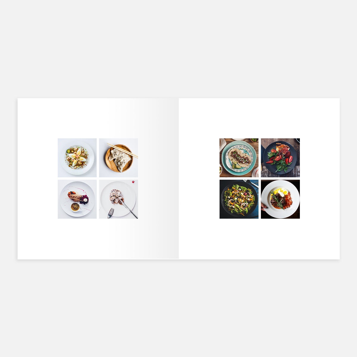
Though we all have them on our camera roll, photos of food might seem out of place on their own among shots of grand architecture and landscapes. Try grouping them together to create a colorful display of your adventurous palette. A four-square layout lends itself nicely to that four-course menu or showing off favorites from the trip overall. Bonus points for including a caption with the provided text boxes to note the restaurant or dish.
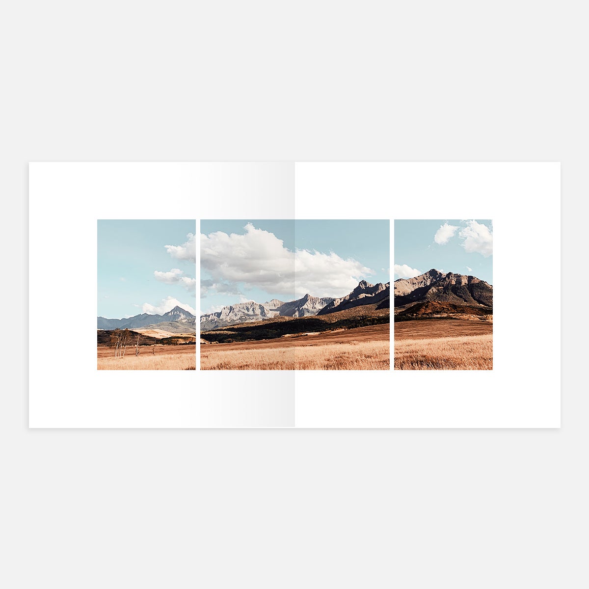
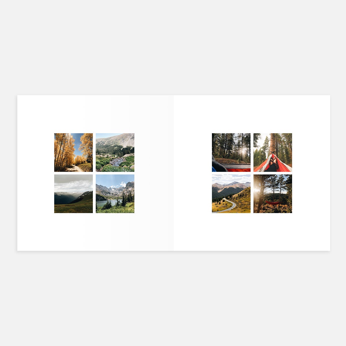
Often times, the best panoramic shots come from landscapes and cityscapes captured on the road. While our Layflat Albums offer full-page spreads, most photo books with traditional "perfect binding" require you to get a little more crafty to incorporate those wide aspect ratios. We recommend mocking this panoramic effect with a series of four photos that span across the spread, aligned to the spine in the middle.
Bring Them to Life In
The Hardcover Photo Book
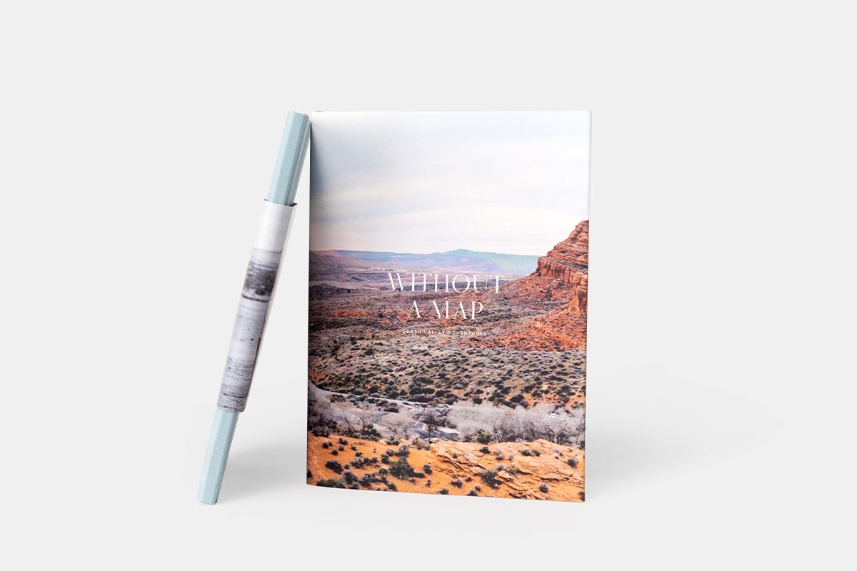
Our recommendation for sharing your latest trip? The Hardcover Photo Book combines high quality with display-worthy cover designs, so you'll want to flip through again and again.
Family Album Layout Ideas
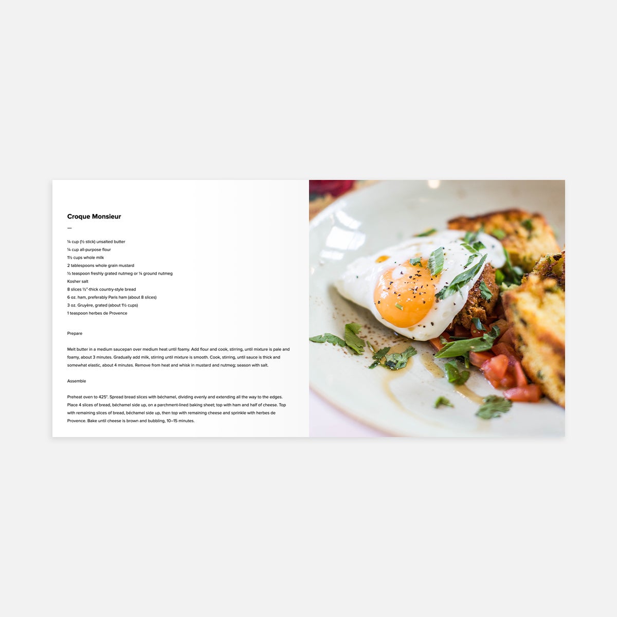
All those family recipes deserve a permanent home in print. For a basic photo album layout option for cookbooks, feature a full-bleed photo on one page, alongside a text JPG/PNG of the recipe on the other half of the spread.
Pro tip: Type up the recipe in another word-editing program, like Google Docs or Keynote, and simply take a screenshot to upload as an image.
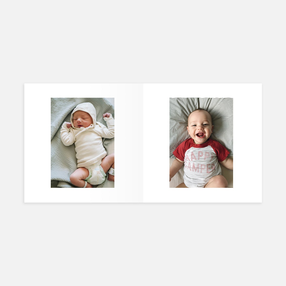
Show how your kids have grown up over time with a series of solo photos, side by side or with siblings. You can do this over the course of a few spreads, using the Portrait layout on each page.
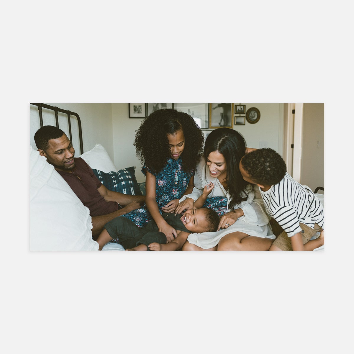
Feature your favorite family portrait (you know the one where you’re all smiling) with a full-spread, full-bleed landscape layout. We love starting or ending a photo book with this page design, as the scale helps evoke an emotional reaction to the photo.
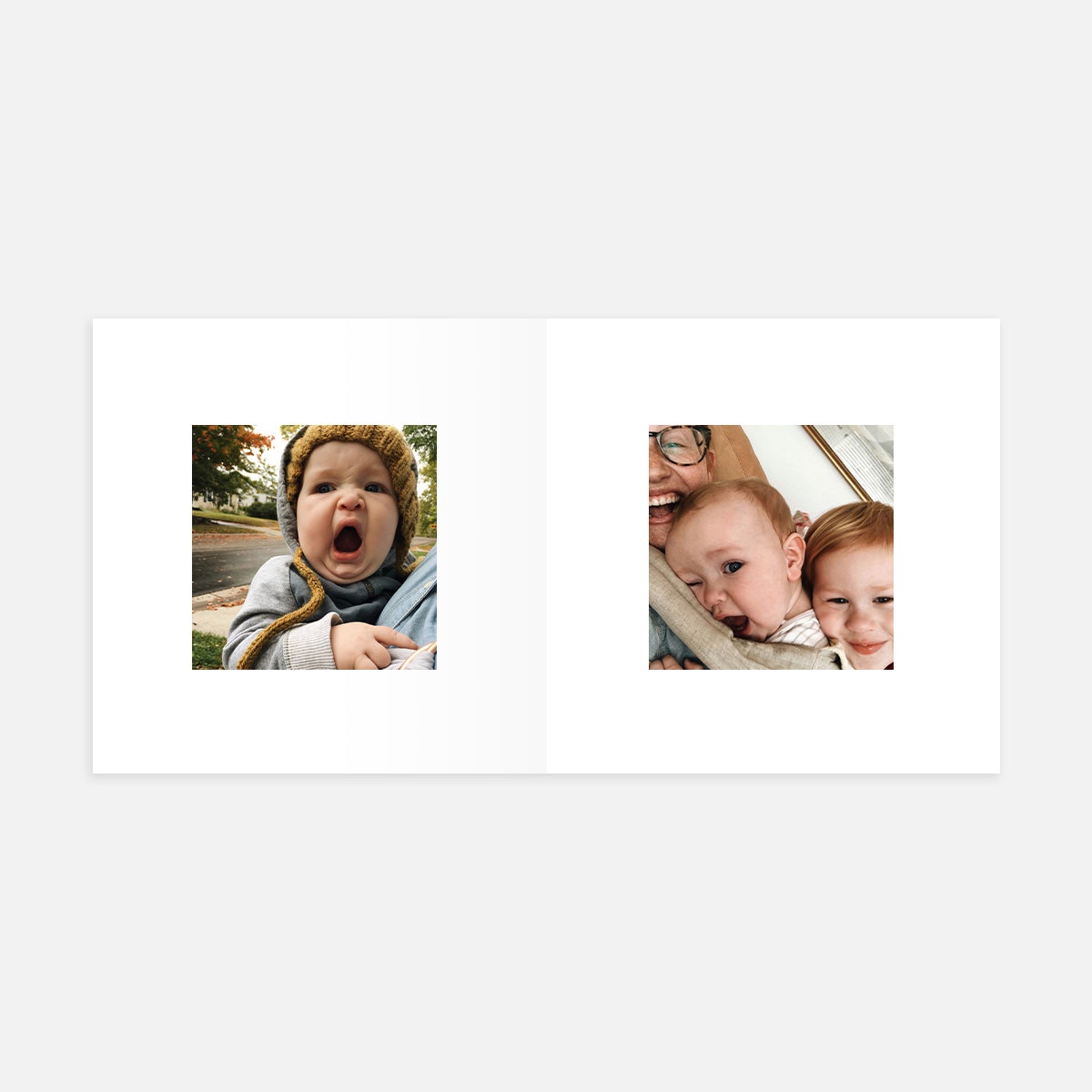
Small square layouts are great for those silly selfies, especially with lower resolution from a smartphone's forward-facing camera. There's no better way to lend your book a little lightheartedness!
Bring Them to Life In
The Everyday Photo Book
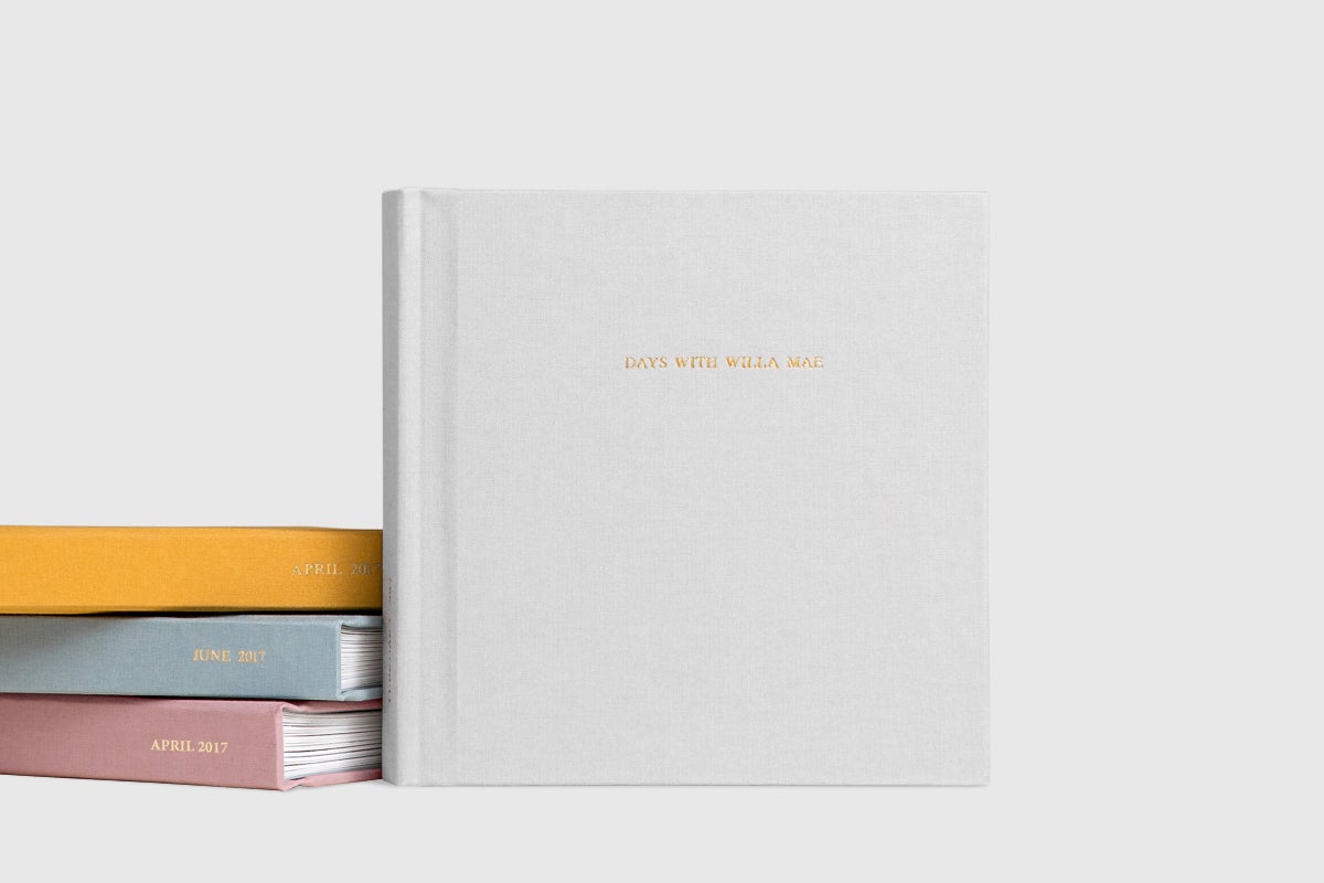
The Everyday Photo Book, with its extremely simple, one-photo layouts, makes printing photos of family extra easy. Plus, it's a great gift to make in multiples for siblings, grandparents, and the whole gang!
Pet Photo Album Layout Ideas
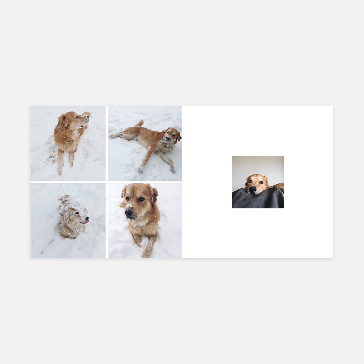
Rarely do we get the shot on the first snap, especially when pets are involved. Use a multi-photo layout to show the various takes — or shall we say outtakes — with your pet in achieving that picture-perfect pose.
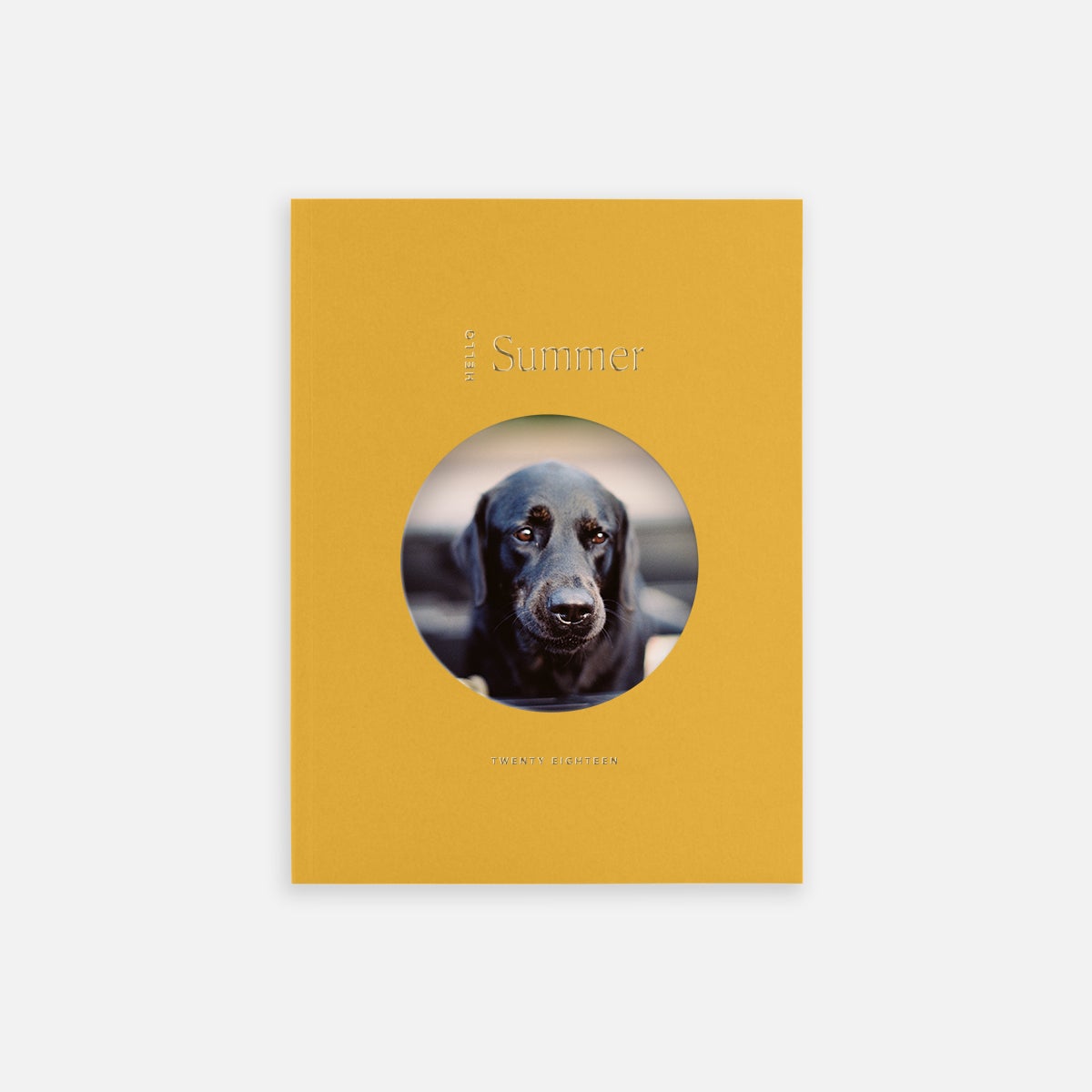
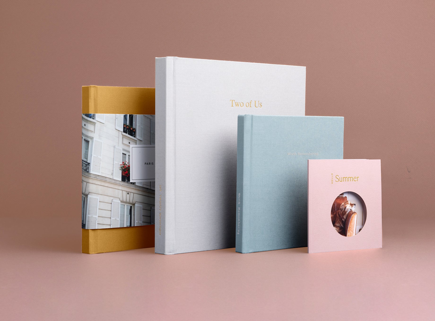
Who hasn't used Portrait Mode with their pet or used a treat to coax the perfect expression? Use that one favorite gem on the first page's circular image that peeks through the die-cut cover, showing off their cute mug front and center.
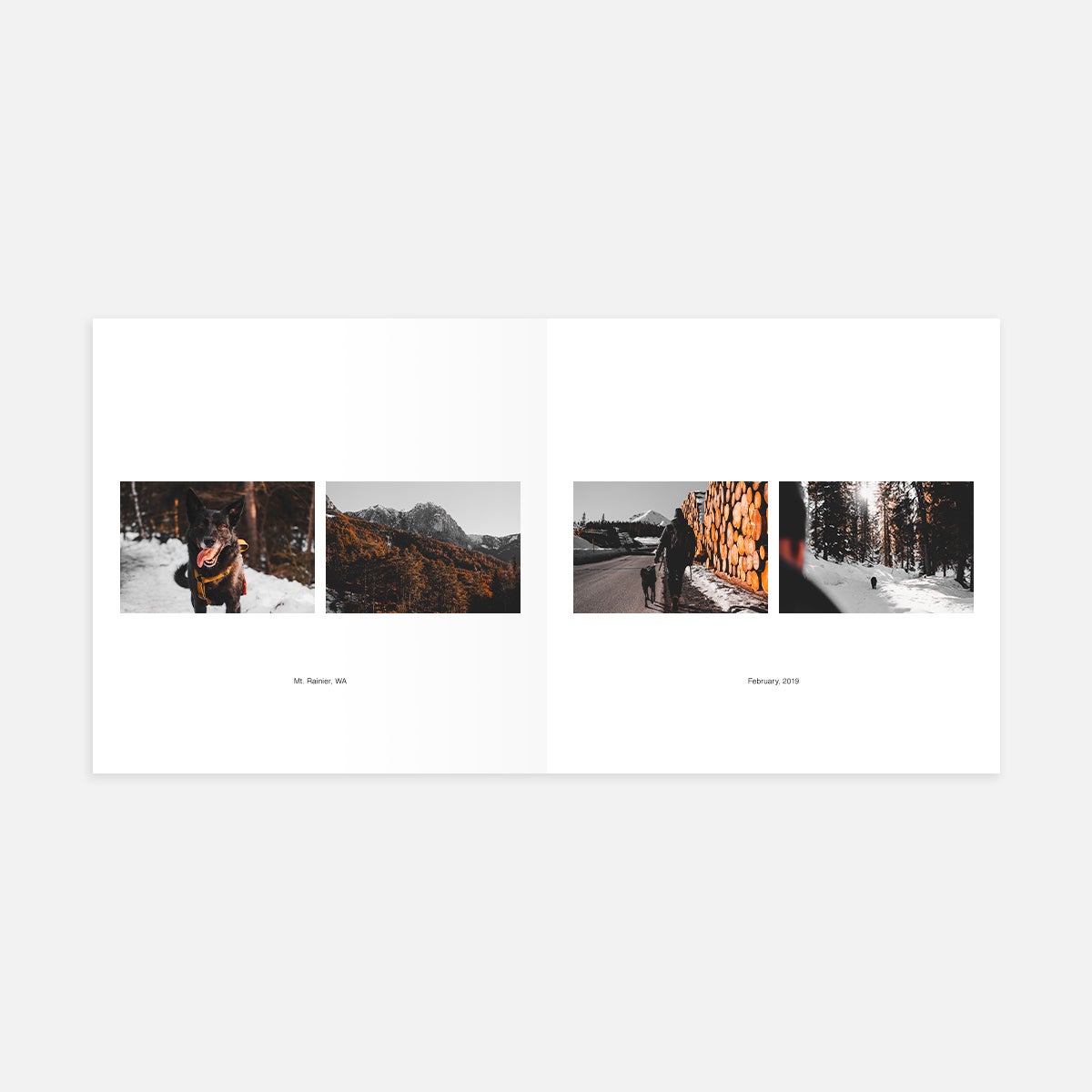
We all know those outings with your furry friends are some of the best times of their lives — or at least their joyful expressions would say so! For those happy snaps of your adventures together — out the car window, going for a hike — the landscape orientation allows you to show your pet along with the setting or scenery in the background. Include a caption to record the location and date of your field trip.
Bring Them to Life In
The Color Series Photo Book
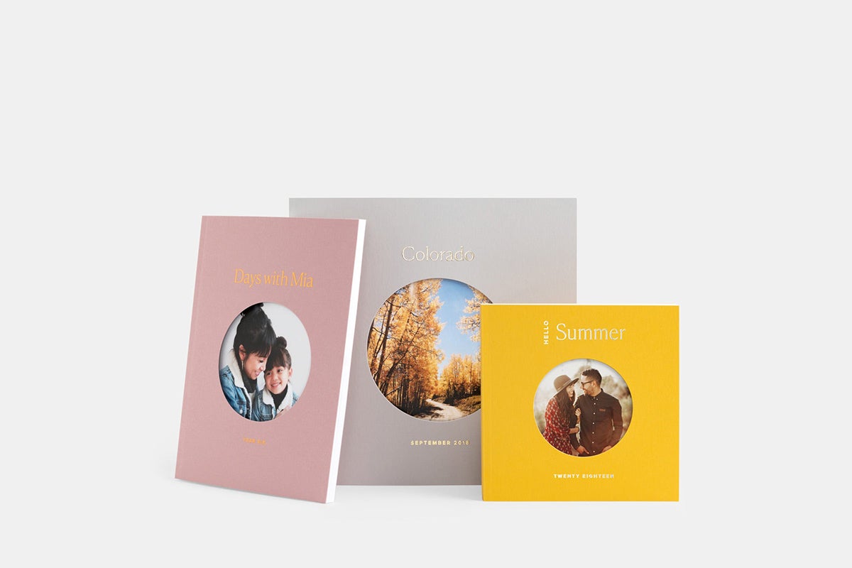
Lightweight with lots of personality, the Color Series Photo Book makes for a perfect home for your pet photos and everyday moments spent with animal companions.
Portfolio Layout Ideas
In a writing portfolio, the words can often speak for themselves. Try a full-page text-only layout, or if you plan on uploading a designed image of your words, a full-bleed single-photo layout will do the trick.
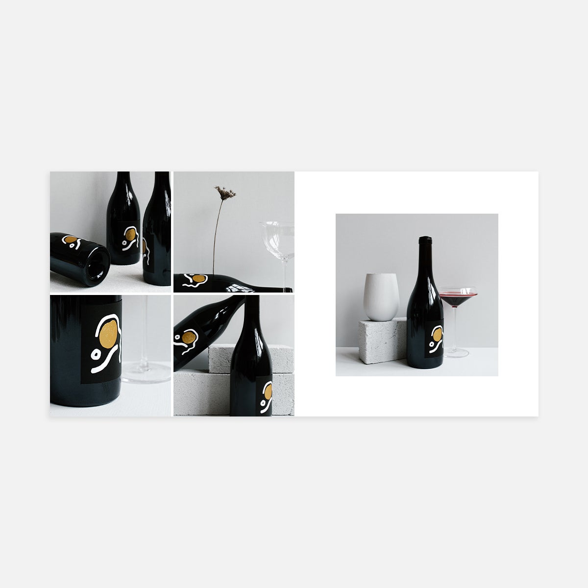
Showcase different aspects of your work with four varying angles and close-ups in a series. This is especially handy for print and packaging work, where small details like texture can really shine.
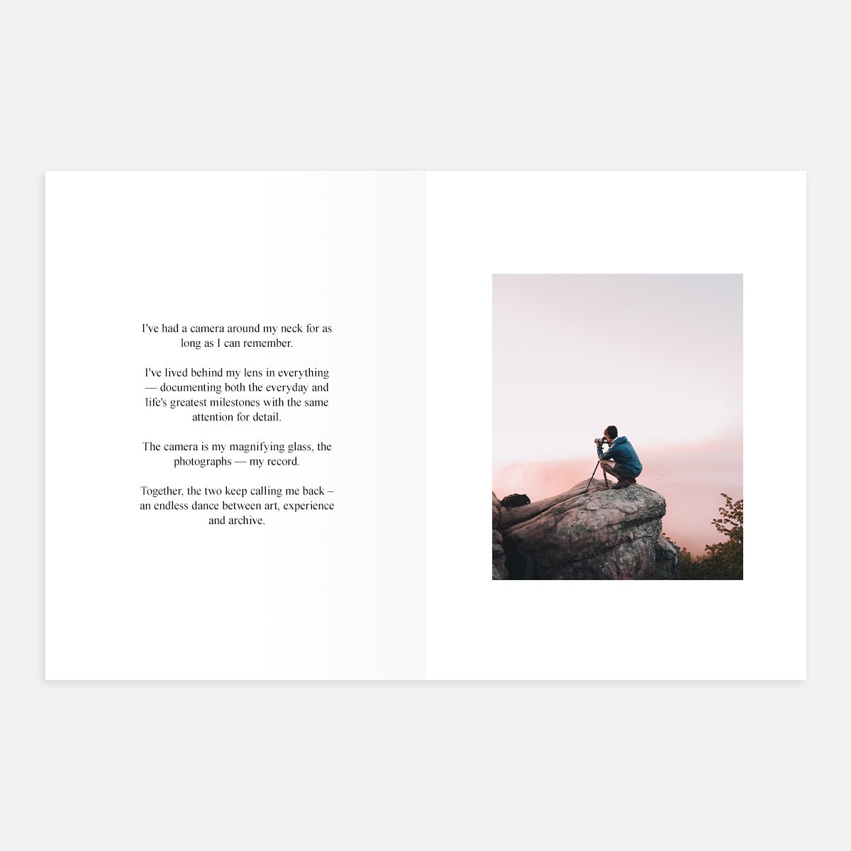
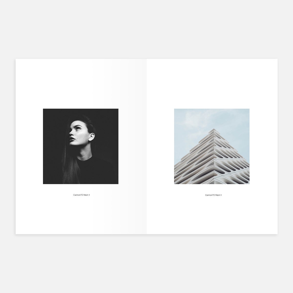
Give each photo some breathing room by showcasing one photo per page, with a text box for notes about your camera settings or artistic vision.
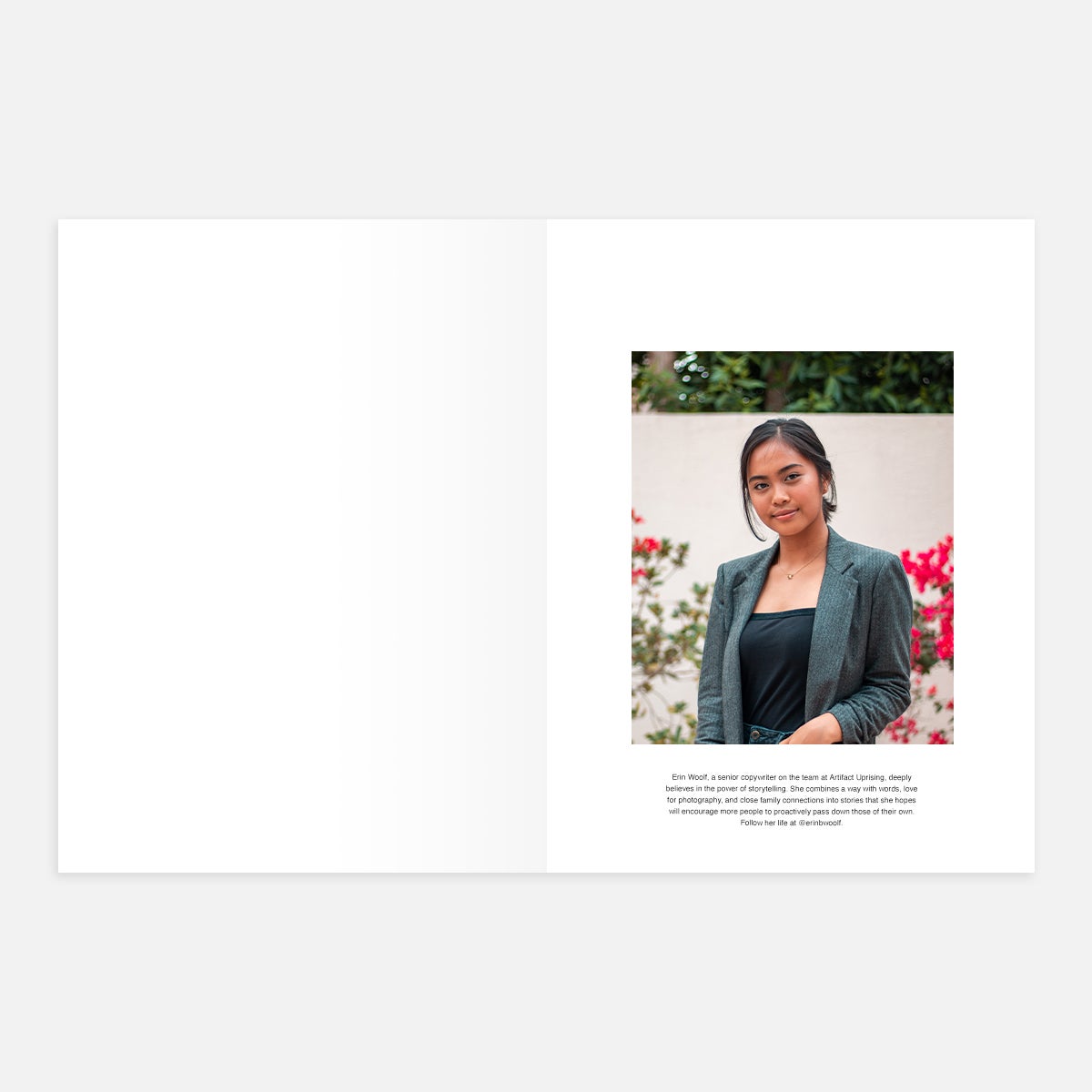
Put your headshot front and center, boldly on display in a large portrait layout with a caption beneath it. This adds a face to the name and provides space for a few words about yourself and your skill set.
Bring Them to Life In
The Softcover Photo Book
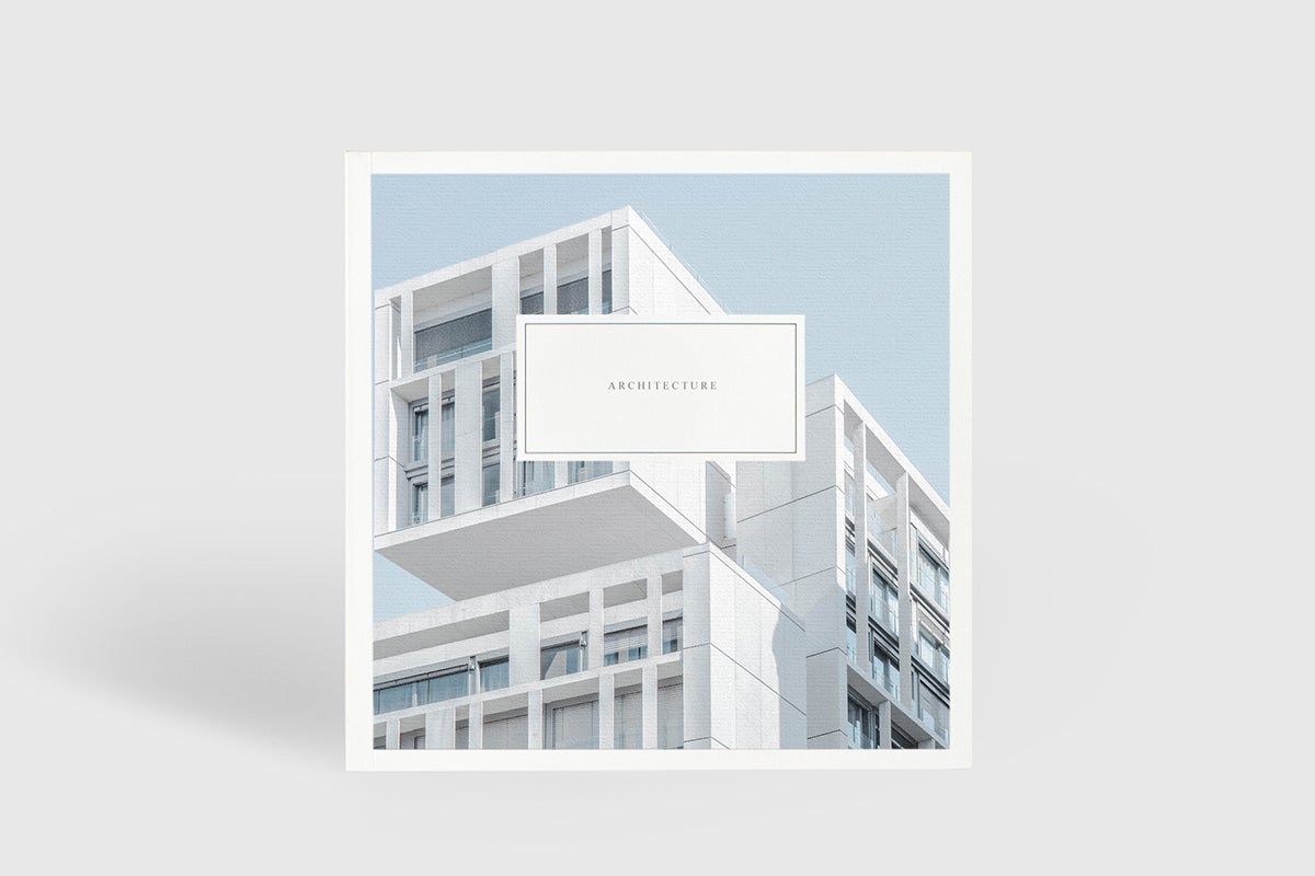
Organizing a portfolio is much like organizing photo albums: you'll want to give each piece of work the visual white space and highlight it deserves so the reader can focus as she feathers through. For this purpose, we believe the simplicity of a large Softcover Photo Book makes just the right statement, while giving you creative reign over the cover page. Plus, its perfect for creating multiple copies!
Year-in-Review Layout Ideas
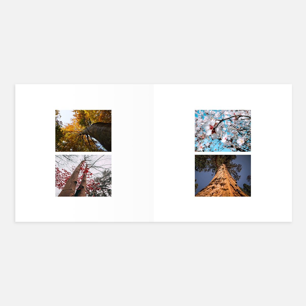
Show a snapshot of how the past year's seasons looked during your life — maybe with a picture taken in the same place during winter, spring, summer, and fall to show progression and growth. This can be done with any partial two-image layout on the left and right side (creating a four-photo spread, total).
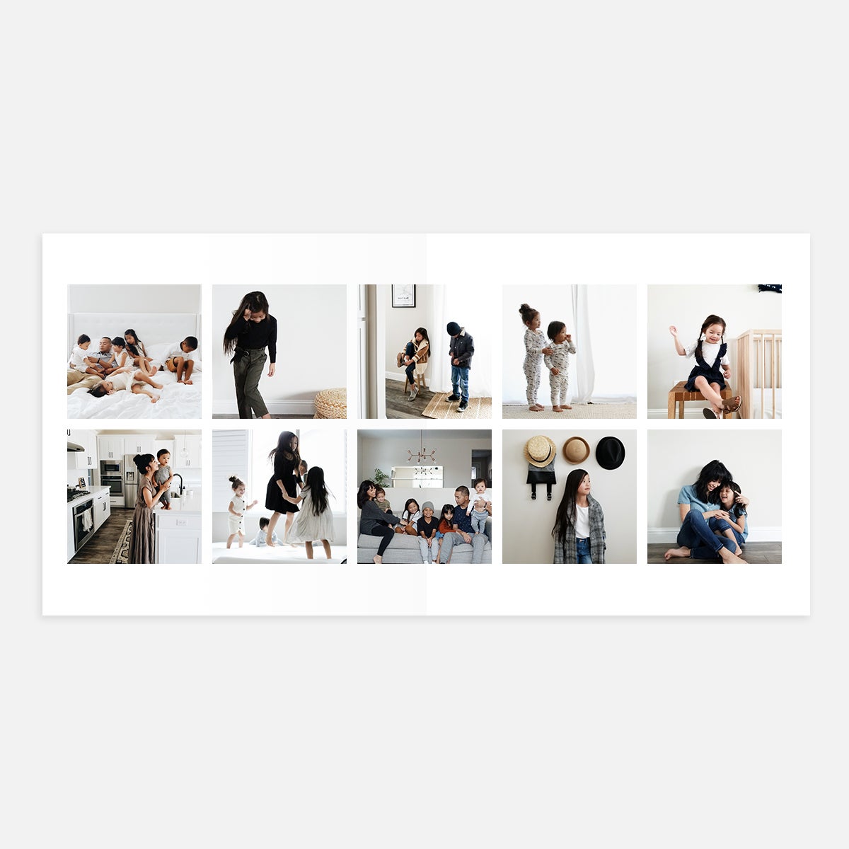
With small images in a grid format, it's easy to make a lot of candid phone photos look cohesive when grouped together. Use this layout to show the dance floor at parties or late dinners at local spots, giving a nod to well-plated courses and good company.
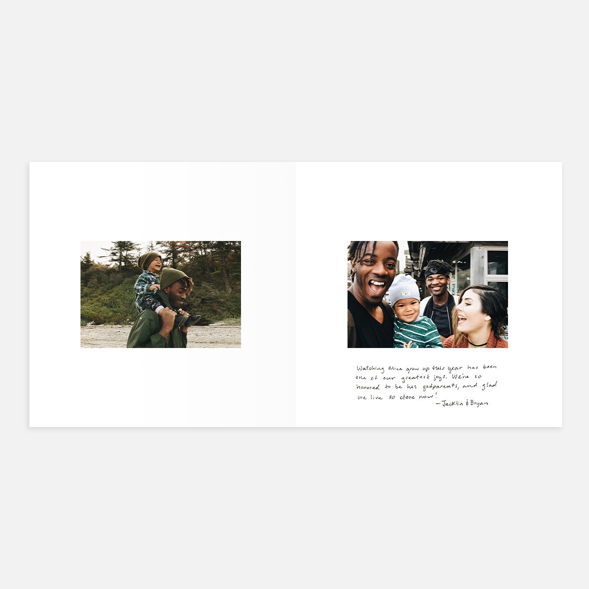
Try getting friends and family to handwrite their memories of a moment from the year to document their perspective, yearbook style.
Pro tip: Our Superfine (matte) paper option with plenty of white space works best for writing in your album.
Did you visit the same restaurant? Tend to the same garden? Make the same meal time and time again? Take pictures of each visit or repetition and display them all together for a quick snapshot of your favorite things over the year.
Bring Them to Life In
The Signature Layflat Album
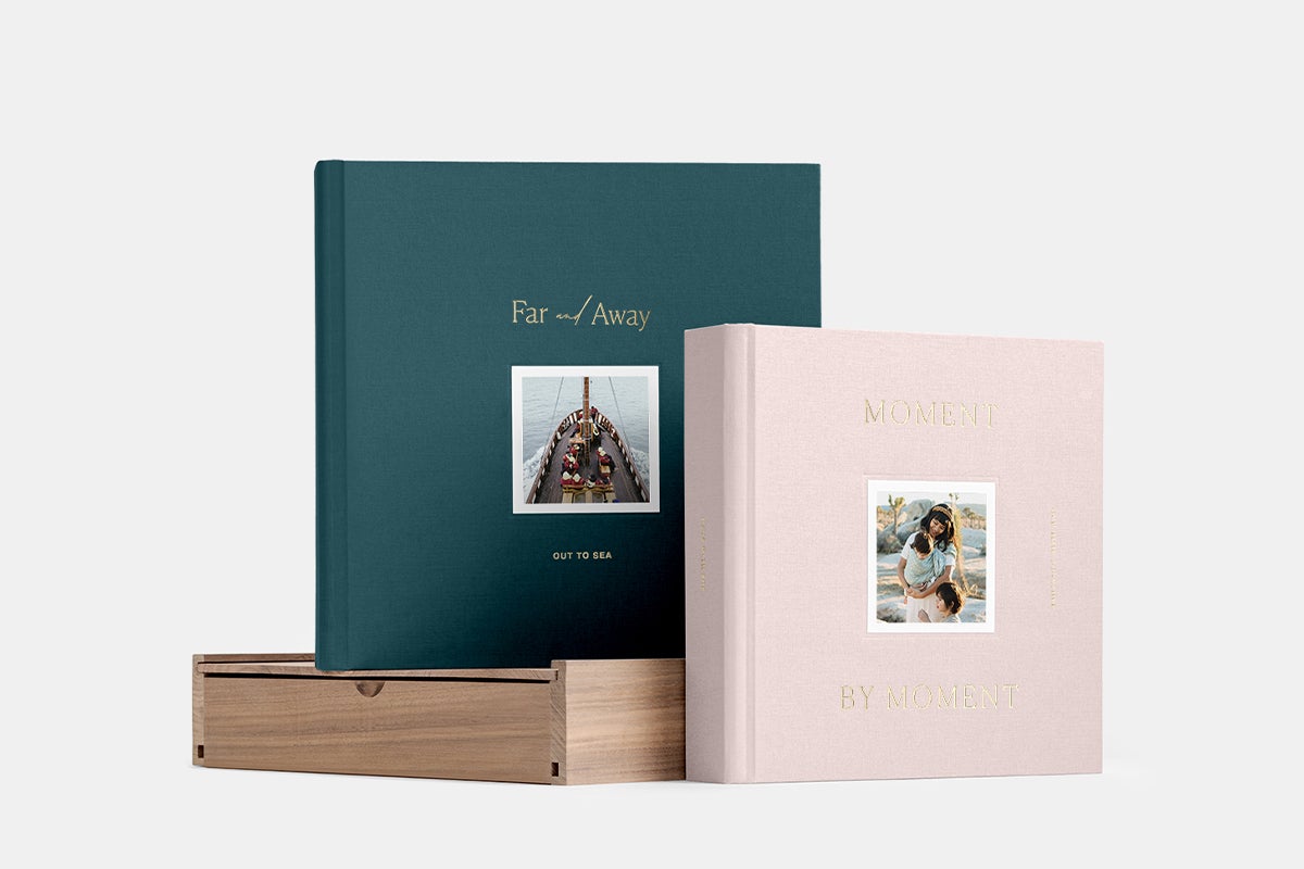
What better photo book to encapsulate a full year of life than a Signature Layflat Album, made to honor both the milestones and everyday moments. We recommend the "Moment by Moment," "Better Together," or "Simple Text" cover designs to match the retrospective occasion.

